What makes jewelry feel fresh in 2026? For us, it starts with color—not a strict rule about what is in or out. This color-first edit of jewelry trends is an invitation to notice the shades you reach for, then use one thoughtful accent to make familiar clothes feel more like you. Rather than treating jewelry trends as a checklist, think of this as a palette you can return to. Think tomato red against crisp white, sea-glass blue beside denim, or a quiet sage detail that brings warmth to a neutral knit. These are styling ideas, not predictions backed by a trend report: the most lasting direction is wearing what you genuinely enjoy. Start with your wardrobe, use the suggestions below as a palette, and let the jewelry earn its place through repeat wear.
Start with a color, not a rule
A simple way into color-led jewelry trends is to look at the clothes you already wear most. Pull out a favorite shirt, scarf, or sweater and identify one color in it that you would like to bring forward. You do not need to match that shade exactly. A related tone can feel more considered: rust beside coral, pale blue with deeper navy, or moss green against a warm cream. When the jewelry echoes one note from an outfit, it ties the look together without making every element compete. A useful way to make jewelry trends feel personal is to start with that familiar color.
Try the reverse, too. If your closet is mostly black, denim, white, or tan, let the jewelry supply the color and keep the rest quiet. A clean neckline and one saturated necklace can feel complete without a print or extra accessories. With a patterned blouse, pick a single shade already present in the pattern, then repeat it in a small earring or bead. Repeating a color once is often enough; you do not have to coordinate shoes, bag, and jewelry into a matching set. This makes jewelry trends less about exact matching and more about repeating a mood.
Consider intensity as well as hue. A bright red bead reads lively against soft white, but can look more grounded with charcoal or dark denim. Powder blue feels gentle beside cream, while the same blue against black becomes crisp and graphic. These jewelry trends work best as a personal palette exercise: lay two or three pieces beside the outfit in daylight, step back, and notice which combination looks balanced from a few feet away. If a color feels like a costume, scale it down; if it makes you smile, that is useful evidence. That flexibility is at the heart of wearable jewelry trends: balance matters more than color rules.
For a practical starting point, browse the necklace collection for a color focal point and keep the remaining pieces simple. A single beaded strand is an easy bridge between a basic top and a more expressive outfit. The aim is not a perfectly assembled trend uniform, but a small decision that changes the mood of something you already own.
Let one saturated piece do the talking
Among the easiest jewelry trends to try is the one-color statement: choose one vivid or deep piece and give it breathing room. A necklace in tomato, coral, cobalt, or ink blue can carry an outfit built from familiar staples. Wear it with a plain crewneck, a crisp button-down, or a simple dress, and let the neckline stay otherwise uncluttered. This is especially helpful when you want color but do not want to spend the morning planning a complicated stack.
Scale changes the effect. Chunkier beads feel relaxed and graphic; smaller beads create a finer line of color. A short necklace keeps attention near the face and works naturally with open collars and simple necklines. A longer piece draws the eye down the center of the outfit and can sit over a solid knit or shirt. Check where the strand falls against your neckline and fabric before deciding: the most useful piece is the one that sits comfortably and remains visible without catching or crowding the clothing. When trying jewelry trends, scale and placement matter as much as color.
For a real example from the catalog, Karia is described as a 42-centimeter necklace made with 10-millimeter red glass beads and silver-plated mixed-metal details. That combination shows how a strong warm color can coexist with a cooler metal accent. Try it with a white tee and jeans, or use it to sharpen a navy top. If you prefer a deeper, more atmospheric blue, Midnight is listed as ink-blue glass beads with a shell-like charm and gold-plated mixed-metal details; its approximate 40-centimeter length has a 5-centimeter extender. The contrast of blue and gold feels polished without requiring an elaborate outfit. Together, these examples show how jewelry trends can be expressed through different temperatures and textures, not just one seasonal shade.
Keep the supporting details low-key. If the necklace is the focus, choose small earrings or a familiar plain hoop rather than another large focal point. A second color can work, but let it be much smaller—a narrow stripe in a shirt, a bag detail, or a bead on a bracelet. This editing approach keeps expressive jewelry trends wearable across errands, workdays, and dinner plans. If you want more options, explore earrings as a smaller-scale way to repeat or echo the dominant color. These jewelry trends are easiest to wear when only one element asks for attention.
Build softer color stories with tonal layers
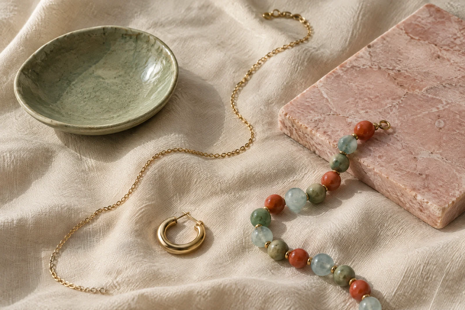
Not every color story needs a bright centerpiece. One of the gentler jewelry trends in this edit is tonal dressing: combine neighboring shades so the effect is soft rather than high contrast. Such jewelry trends are subtle, but still bring intention to a simple outfit. Sage, olive, and warm cream make a calm group; blush, rose, and coral feel sunlit; different blues can suggest a coastal palette without relying on literal motifs. A single gold accent adds warmth and helps the colors feel connected, while silver can sharpen cooler combinations.
To build a tonal look, choose a base color from your clothing, then bring in one lighter or darker version through the jewelry. A green top can sit comfortably with a muted green bead or a warm natural stone; a cream dress can take blush or pale blue without losing its ease. If the jewelry already contains several shades, simplify the outfit rather than adding more. This is a good rule for getting dressed: let the busiest item set the limit for everything around it.
Layering can make tonal color feel personal, but it works best when each piece has a clear role. Start with a short chain or delicate strand, then add a second necklace with a different length or texture. A fine chain beside rounded beads gives contrast even when the colors are close. This is a practical detail to remember when adapting jewelry trends to pieces you already own. Leave enough visual space between the strands so they do not tangle or merge into one line. If necklaces keep crossing, wear just one on a busy day; a thoughtful single piece is still a complete look.
Catalog color can offer a concrete reference without dictating a purchase. Fenella is described as coral-colored acetate beads with a central gold bead and gold-plated mixed-metal details, at approximately 42 centimeters plus an extender. Its warm palette suggests an easy pairing with white, cream, denim, or a muted pink top. For a softer overall result, keep earrings small and choose a blush or sage layer in clothing instead of adding another bold necklace. Product materials and lengths are stated as catalog descriptions; use the item listing for its current details.
Metal does not have to match every other piece exactly. A small gold accent can sit alongside silver details if the color story feels intentional. For a relaxed mix, repeat one metal somewhere else—perhaps a small earring, watch, or buckle—rather than demanding a perfect match. More helpful than a rigid rule is proportion: when colored beads are visually strong, make the metal elements quieter; when the jewelry is mostly fine chain, a little shine can add definition.
Make the edit personal—and wearable
The best response to jewelry trends is selective. Before adding anything to a look, ask what job the piece is doing: bringing color to a neutral outfit, echoing a shade in a print, adding a playful note, or making a simple neckline feel finished. If you cannot name the role, try taking one accessory away. A cleaner composition often makes the piece you love more noticeable.
Think about comfort and context, too. For a long day in motion, consider whether a pendant swings where you want it to, whether a necklace catches on the collar you plan to wear, and whether an earring feels proportionate to your hairstyle and plans. These small practical checks make an expressive choice easier to repeat. Jewelry that works with your real routine is more useful than a look that only makes sense in a mirror before you leave home.
A helpful weekly habit is to make a small outfit-and-jewelry shortlist rather than chasing every new idea. Put two tops beside one colorful piece and see which pairing feels natural. Photograph the combinations if that helps you remember them. You may discover that a vivid necklace works with more of your wardrobe than expected, or that a softer shade is the one you reach for most. Either way, you are developing a personal reference rather than following a calendar of supposed must-haves.
Color can also be seasonal without being limited to one season. Coral and red can brighten a dark winter layer; cool blue can feel fresh with summer linen; sage and blush can move easily between a light dress and a heavier knit. That flexibility is why our view of jewelry trends is less about a single headline hue and more about using color to give existing outfits another life. If you are refreshing a rotation, the new arrivals page can be one place to explore, while your own closet remains the best guide to what will get worn.
Finally, let your eye change. You might prefer a strong contrast one week and a nearly monochromatic palette the next. Keep the pieces that make getting dressed feel easier or more joyful, and do not treat a trend label as a deadline. That is a useful way to approach jewelry trends without losing your own point of view. That, to us, is the best test for jewelry trends: a piece should fit your day as well as your outfit. The most convincing color-first styling has room for a favorite old necklace, an unexpected new combination, and the freedom to wear the same piece differently tomorrow.
Related reading
For more ideas with a coastal point of view, continue with Coastal Jewelry: Bringing a Little Seaside into Your Style, explore Shell Jewelry: Natural Variation and Styling Ideas, or read Fish Necklaces: A Playful Motif with Everyday Appeal.
"